Why Outdoor?
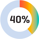
About 40% of people who see a billboard become a customer. Outdoor has long been a local ad solution for national brands. And a brand-building solution for local businesses.
How does OOH add up?
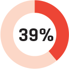
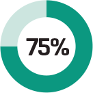
Among people who have seen an out-of-home (OOH) ad in the past month:


 We spend 70% of our waking moments in life outside of the home, and that's where out-of-home advertising lives. You don't need to "opt-in" to it. You can't turn it off. Beside the sheer size of it, nothing beats out-of-home advertising for the physical impact and unlimited creative potential of your message.
 The perfect partner to other media.
Have an integrated advertising plan? Or a print campaign, mobile app or website? Then how about a boost of up to 300% in effectiveness? That' sthe power of OOH. Whether you're a major brand or local business, outdoor goes beyond a standalone boost for your marketing. And nothing lets you dominate a neighborhood, zip code or an entire local market like an outdoor campaign.
Even standing still, outdoor delivers.
Out-of-home advertising delivers a better CPM (cost per thousand) than most traditional media. In fact, anywhere from more than 50,000 to more than 98,000 people see our billboards every day. And these are customers who buy: 39% of the heaviest commuters have a household income above $75,000. That's 44% greater than the average American. They also rank higher in disposable income and Internet usage–high value targets for any advertiser.
In fact, 68% of consumers have said OOH ads are likely - or somewhat likely - to impact a purchase decision.
How to make your OOH GREAT.
Give it a Big Idea.
- An advertiser should consider the most important product benefit to communicate and express that message to consumers.
- Relate messages to familiar ideas and easily understood concepts.
- Use playful, lively elements.
- Draw on universal elements of life, like home and family.
Design for Impact.
- Use large and legible typefaces.
- Avoid fonts with thin strokes or ornate script.
- Words comprised of both upper and lower characters are generally easier to read.
- Avoid condensed type.
Don't Forget Color.
- Choose colors with high contrast in both hue and value.
- High contrast colors can imporove out of home advertising recall by 38 percent.
- When designing for LED or other light emitting technologies:
- Avoid using a white background. White will appear subdued or muddy without vibrancy while at the same time being perceived as glare.
- Rich background colors are more impactful during daylight hours, while pastel backgrounds are more vibrant at night and on cloudy days.
Simplicity Works!
- Out of home advertising should be a quick burst of essential information.
- The most effective designs focus on a single idea or concept.
- Rely on imagery over words.
